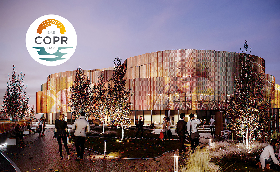
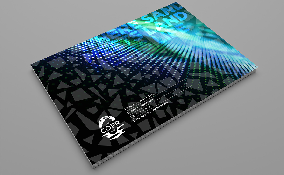
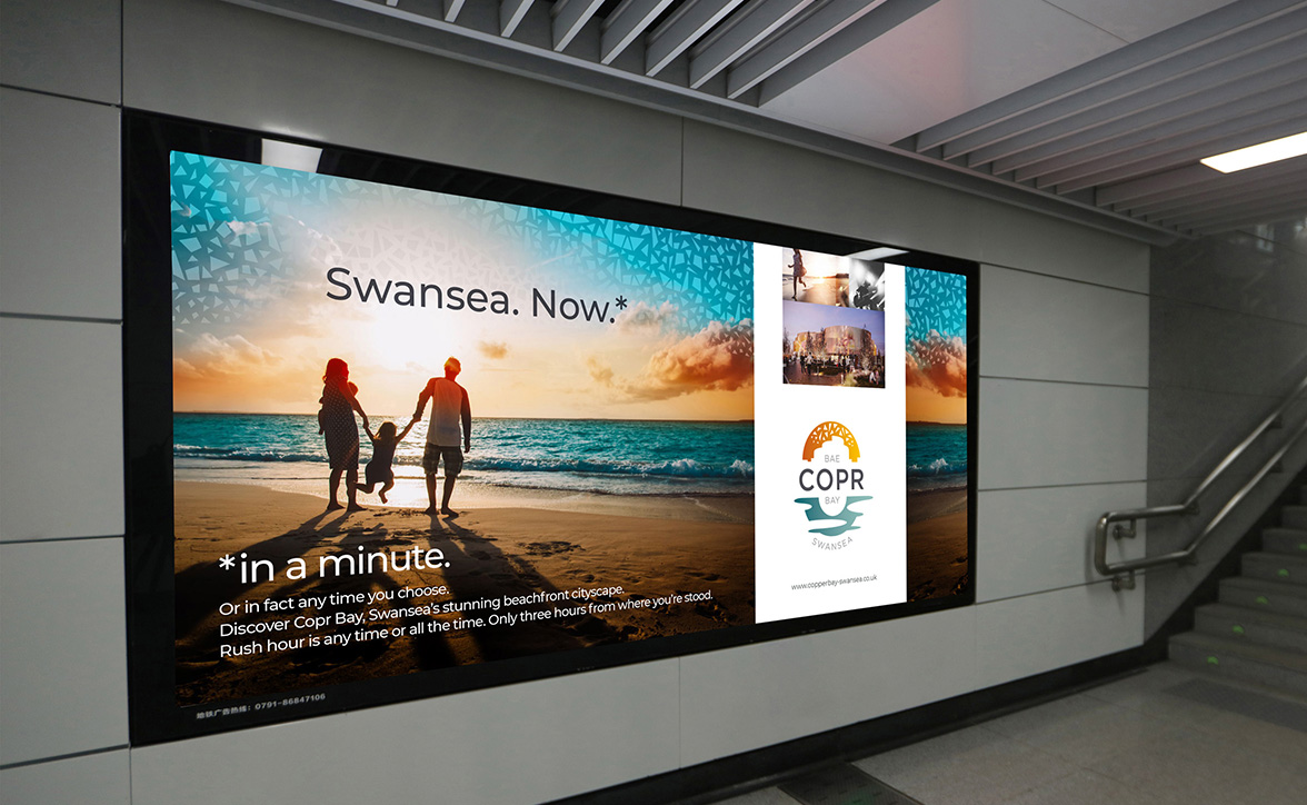
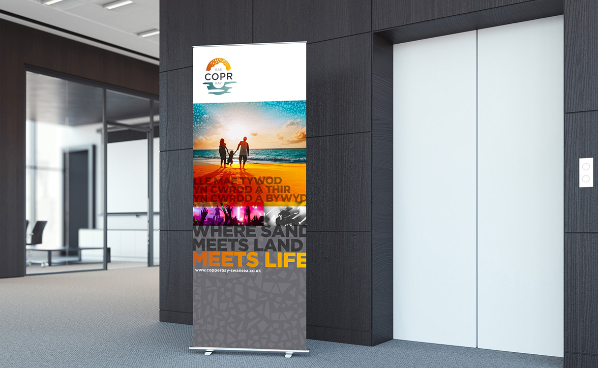
Copr Bay is a major urban transformation project, with over £1 billion being invested across the city, allowing Swansea to realise its potential as one of the most vibrant places to live, work, visit and study in the UK.
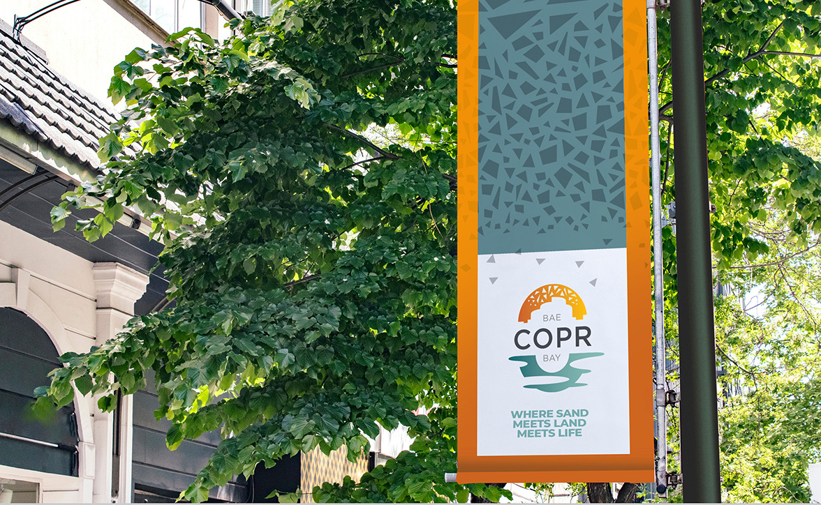
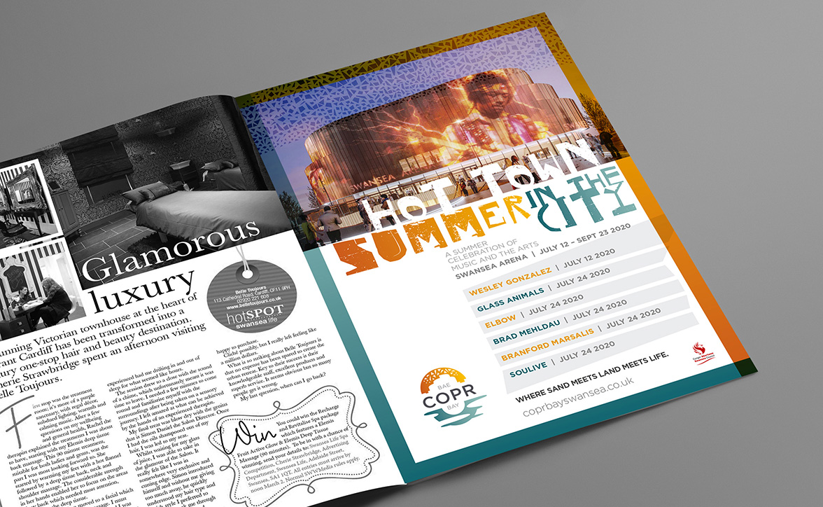
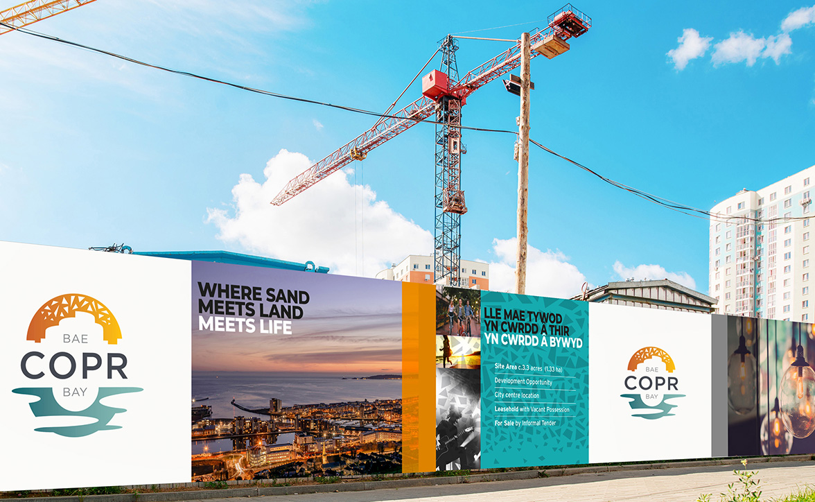
Our concept behind the Copr Bay brand is its industrial past transforming into a vibrant future. The graphic inspiration is the letters that make up the elemental expression for copper – Cu, manipulated to form a reflection over water. The colours represent the vibrant district, and the shapes in the sunrise allude to the architectural features.
We extended this lockup to integrate typography then detailed the elements to describe the geography in more detail – suggesting the skyline and bridge over the waters of the bay. Finally, we invigorated the colour palette to add contrast and dynamics. The result is a brand with many layers to its meaning.
